Fifteen design brands, one strategist.
Handed fifteen brands at once, the temptation is a house style.
The design sector shares a problem: almost every brand in it sells beauty, and almost none of them can explain why their beauty is different from the next studio’s. Handed fifteen of them at once, the temptation is a house style. That would have been the wrong answer, and an obvious one.
So each account got its own vocabulary, built from what the brand actually is rather than from what the category expects. A classical atelier and a minimalist sanitaryware brand cannot share a sentence structure, let alone a palette. What travelled between accounts was method: find the thing only this brand can say, name it, and then say it every month until the audience can finish the sentence.
Below are the ones worth showing.
Rosabagh
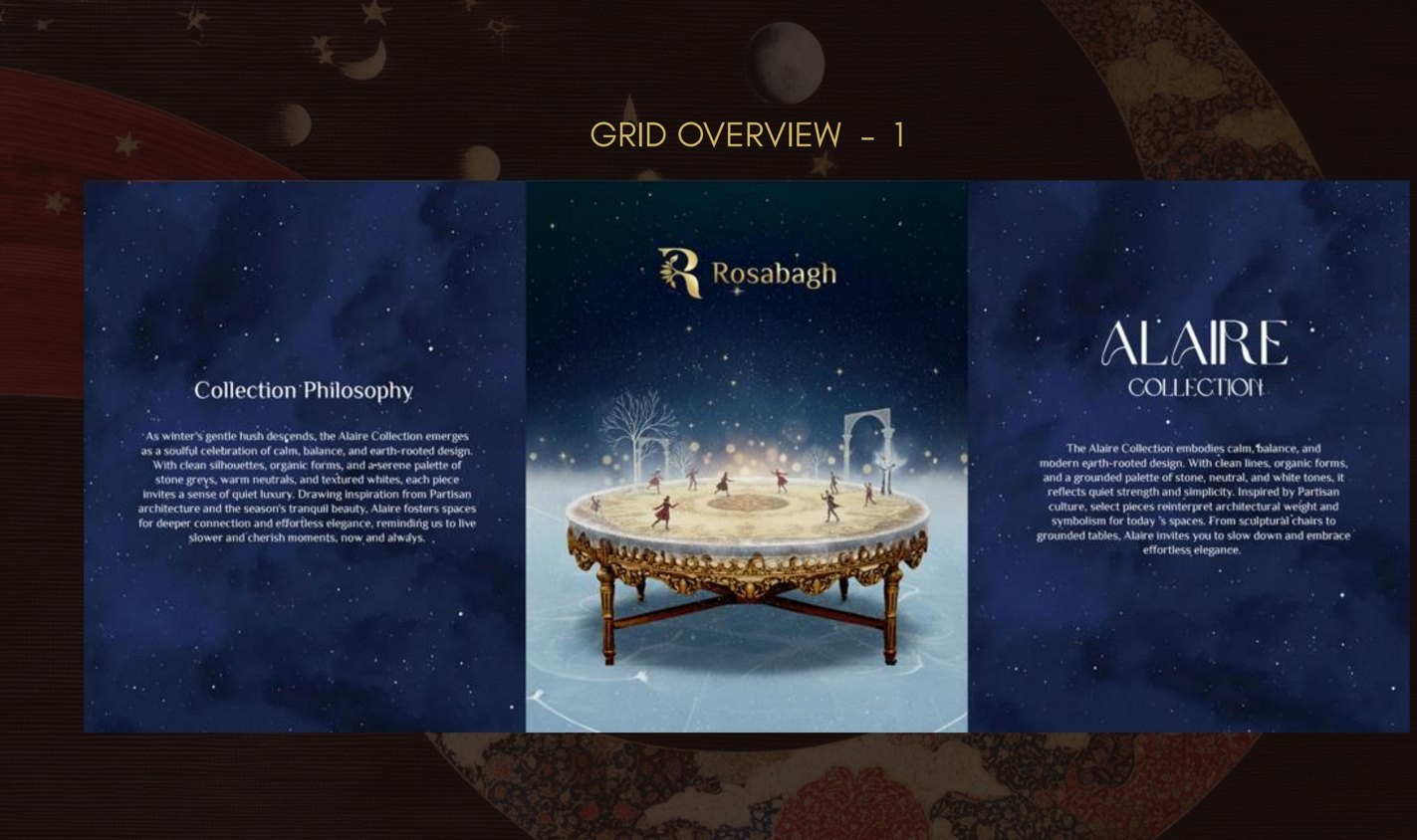
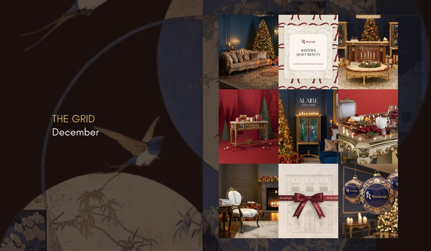
The Alaire Collection, staged like a Cartier winter film
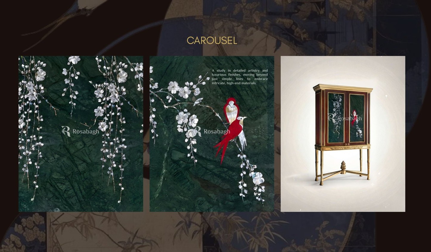
Rosabagh is a classical furniture house in Delhi with a genuine atelier behind it: gold leaf, marquetry, hand carving, jewel-tone marble. The category convention is to photograph a cabinet against a wall and describe the joinery. That sells a cabinet. It does not build a house.
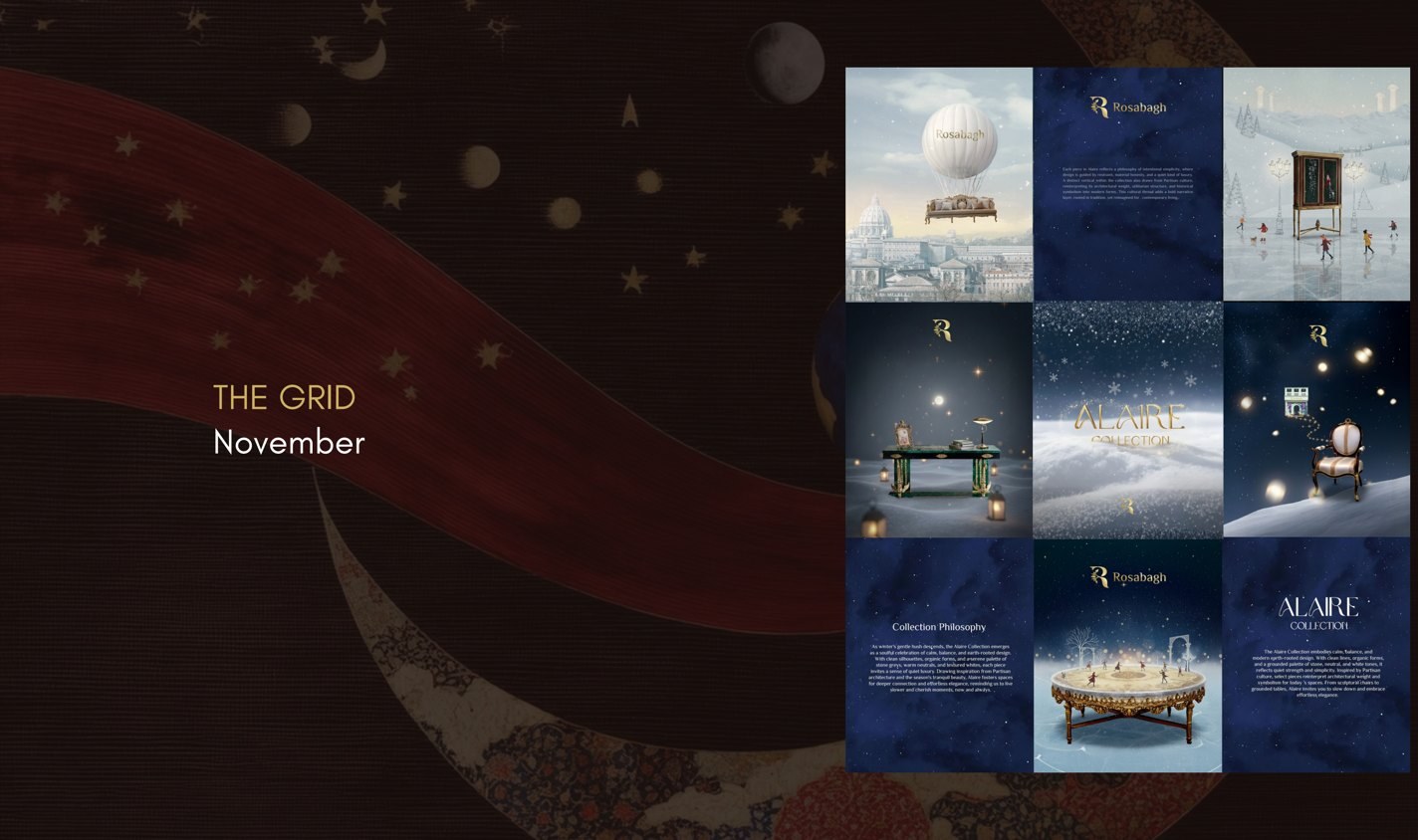
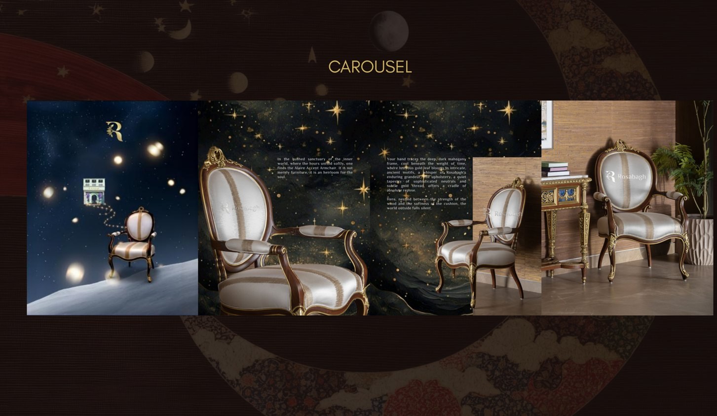
So the brief I set was to stop photographing furniture and start staging worlds, with Cartier and Dior as the reference rather than any furniture competitor. Those houses do not shoot product; they build a fable and let the object appear inside it. Alaire became a winter dreamscape on deep midnight blue, with a hot air balloon over a sleeping city and skaters on what we called a cosmic rink, and the console arrived in the middle of it as the one solid thing in an imagined world.
The collection was given a language before it was given captions. Material Mythology for the way marble, malachite and gold leaf were treated as characters. Eternal Craftsmanship for the atelier posts. Quiet Architecture for the Partisan-influenced structural weight that separates Alaire from ordinary ornament. A vocabulary is what lets a small team write twelve consistent posts a month without a strategist in the room.
- Material Mythology
- Eternal Craftsmanship
- Quiet Architecture
- Eternally Rosabagh
- The Calyx Cabinet
Home ET TU
Contemporary furniture, written as sculpture
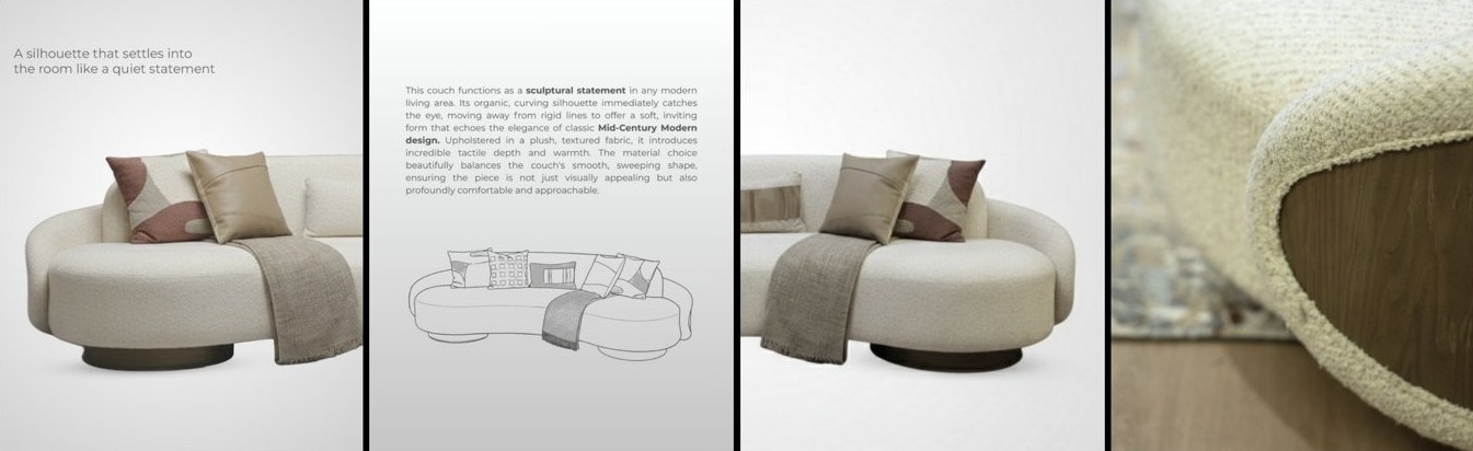
Home ET TU is a modern contemporary furniture brand in Delhi. Curved silhouettes, supple leather, stone and warm metal, the vocabulary of the international design fairs rather than of an Indian showroom.
The strategic problem is the opposite of Rosabagh’s. Minimal furniture photographs beautifully and says almost nothing, because restraint reads as absence unless somebody explains the intent. A curved sofa on a white ground is indistinguishable from every other curved sofa on a white ground.
So the copy carried the argument the image could not. Each piece was written as sculpture with a function attached rather than furniture with a shape: the organic curve as a focal point rather than a style choice, the deliberate contrast of stone against warm metal, the detail you are meant to miss on first look. The Fall/Winter ’26 release was framed as a collection with a mood, forest haze, rather than a drop of new SKUs.
- Quiet statement
- Sculpture with a function
- Deliberate contrast
- FW '26 · forest haze

4th Dimension
Espresso Elegance, and the case for naming a project
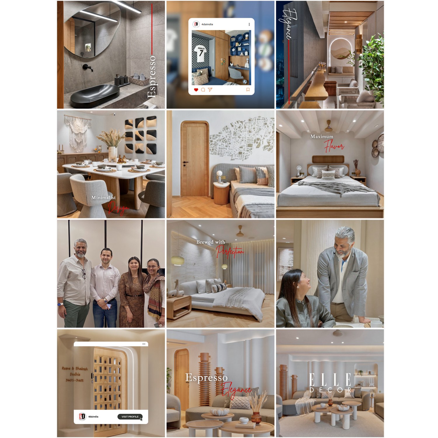
4th Dimension is an architecture and interiors practice led by Ar. Rinki Kotak and Ar. Mihir Kotak. The work shown here is the Dodhia residence, a completed apartment handover, and it is the clearest small example of a habit I apply everywhere.
A finished residence usually arrives on social media as a run of room photographs with the client’s name attached. We gave the project a title instead, Espresso Elegance, and let that title dictate everything: the warm brown and cream palette pulled through every frame, a coffee vocabulary running across the captions, and a grid where the handover plaque, the practice’s own profile and a press mention sit beside the rooms as part of the same story.
Naming a project does something practical. It turns nine unrelated photographs into a series that can be posted over three weeks without the audience feeling repeated, and it gives the studio’s partners something to say when a prospective client asks what they have just finished.
- Espresso Elegance
- Minimalist Design
- Maximum Flavor
- Brewed with Perfection
A named project can be asked about. An unnamed one can only be scrolled past.
FOAID Designs
Functional Geometry, for a studio that also builds
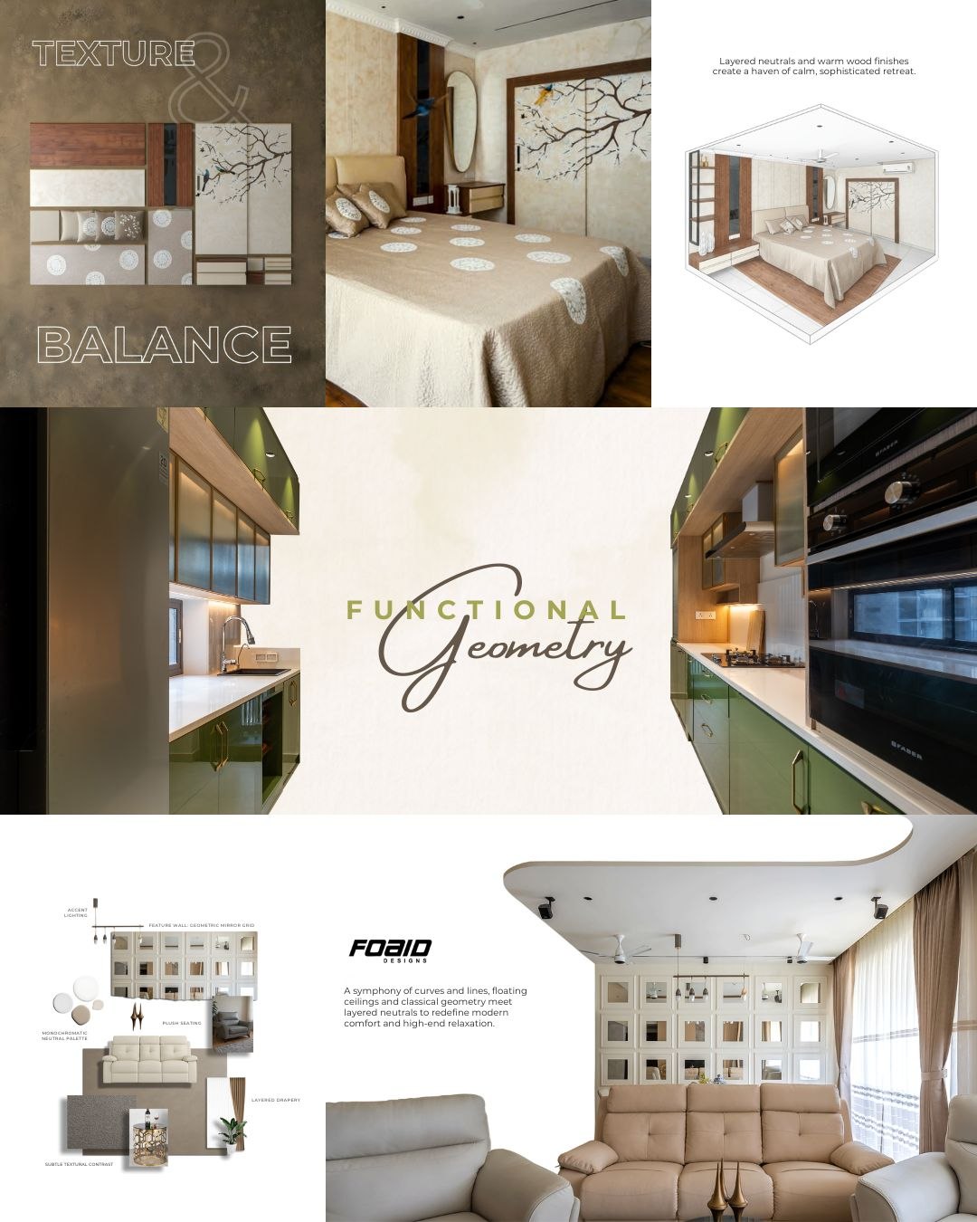
FOAID Designs is an architecture, interior and turnkey studio in Chennai. Like most practices that deliver as well as design, its strongest asset was invisible: the ability to promise a finished room rather than a set of drawings.
The content system built for FOAID pairs each completed space with the material board that produced it, and with an axonometric or annotated diagram that shows the room being reasoned about. Texture & Balance for the material posts, Functional Geometry for the joinery and kitchen work, with the callouts left visible: accent lighting, feature wall, monochromatic palette, layered drapery.
Photographs of finished rooms prove a studio has taste. Annotated boards beside them prove the taste was a decision, which is the only thing that makes a homeowner comfortable handing over a build.
- Texture & Balance
- Functional Geometry
- Board beside room
Mozio
Sanitaryware with a sense of humour
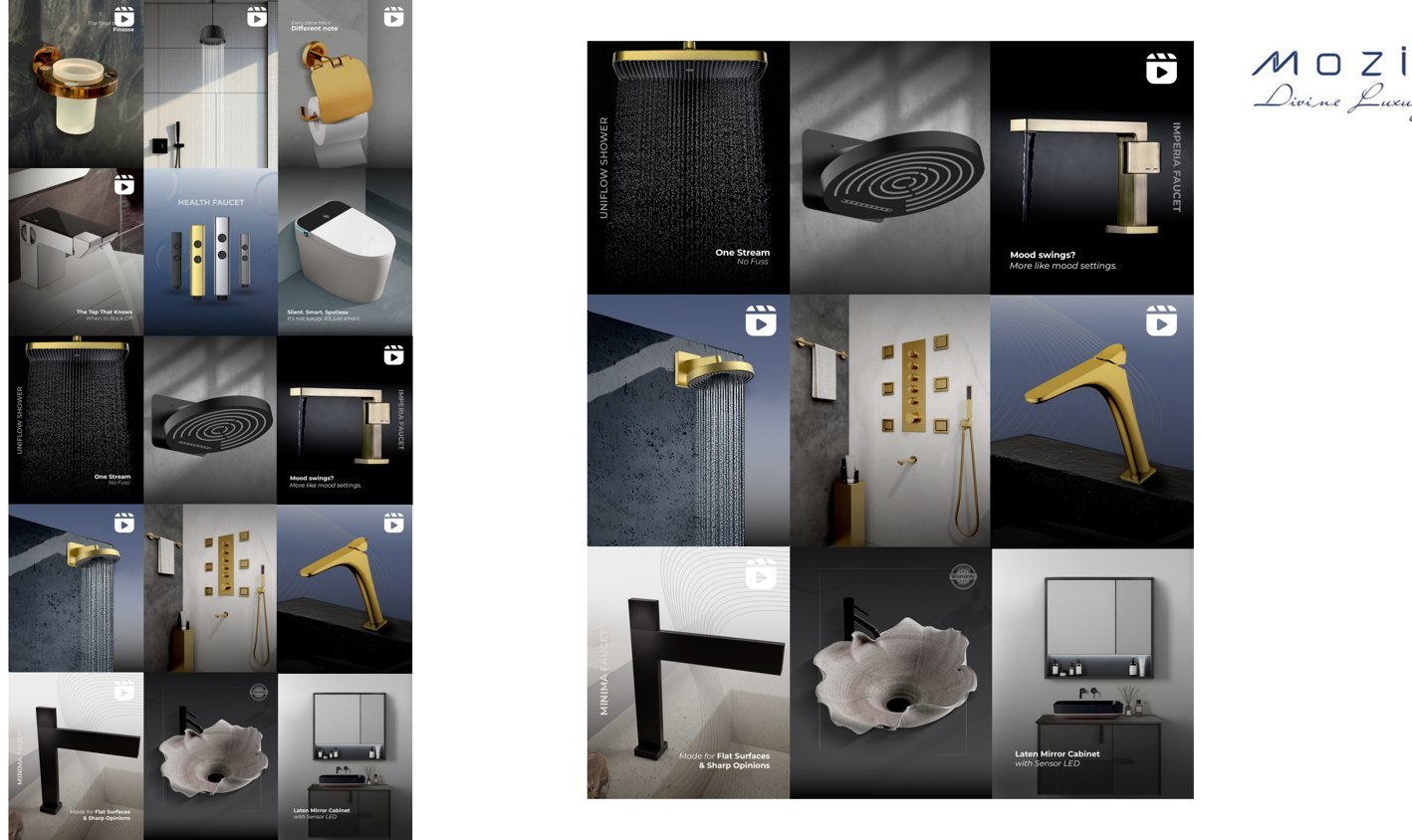
Mozio is a premium sanitaryware and ceramics brand. Faucets, showers, smart WCs, accessories. It is the least romantic category in the design portfolio and, for that reason, the most fun to write.
Every brand in fittings sounds identical, because they all describe the same specifications in the same reverent tone. So Mozio got the opposite: short, dry, confident lines with a joke inside them. Made for flat surfaces and sharp opinions. This faucet has a complex personality. Mood swings? More like mood settings. Forecast: one hundred percent chance of standing under it way too long.
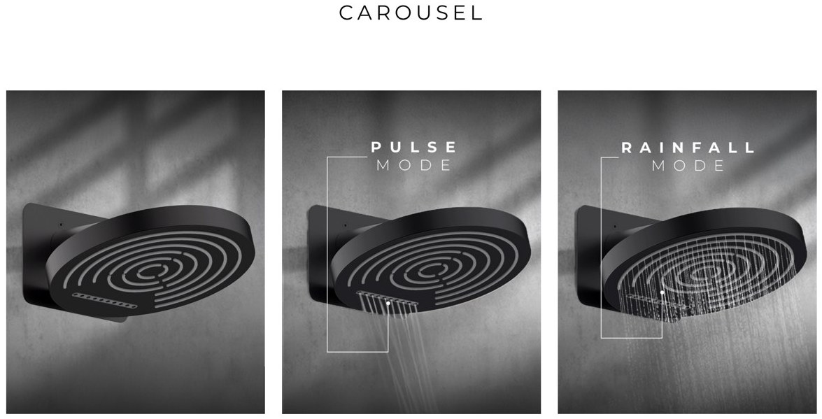
The discipline underneath is not comic, it is structural. Every product got one named property and one only, so the range stopped being a catalogue and became a cast: Minima is sharp, Eclipse glows, Imperia changes with the light, Rainstorm is weather, Switch knows when to back off. A homeowner cannot remember nine faucets. They can remember nine characters.
- One property per product
- Dry, not reverent
- Lifetime warranty as a promise, not a footnote
Two accounts from this portfolio outgrew a section.
Design Essence, an architecture and turnkey studio in Sultanpur, Delhi, where the strategy was to publish the studio’s own floor plans, axonometrics and material boards instead of only the finished render.
The Garden Room, an outdoor furniture house, where the problem was a product the Indian climate makes unusable for a third of the year, and the answer was to sell the season instead of the furniture.
A strategist’s value is not a signature style.
Running fifteen accounts at once teaches one thing quickly: a strategist’s value is not a signature style. It is the ability to arrive at a brand, work out what only that brand can credibly say, and then hold the line on it for a year while a hundred small pressures push towards the category average.
Rosabagh sounds like a fable. Mozio sounds like a dry friend. Home ET TU barely raises its voice. All three were written in the same month, from the same desk, and none of them is interchangeable with the others. That is the whole job.
Brand and content strategy produced at OneDigital, 2024 to 2026, with work for Rosabagh and Design Essence continuing at Markethink. Grids, dockets and strategy documents shown are from decks I wrote and directed. Product photography, renders and project imagery belong to the respective brands and are reproduced here to show the work as published. No client-confidential commercial detail is included.