When the object says very little, the words have to say more.
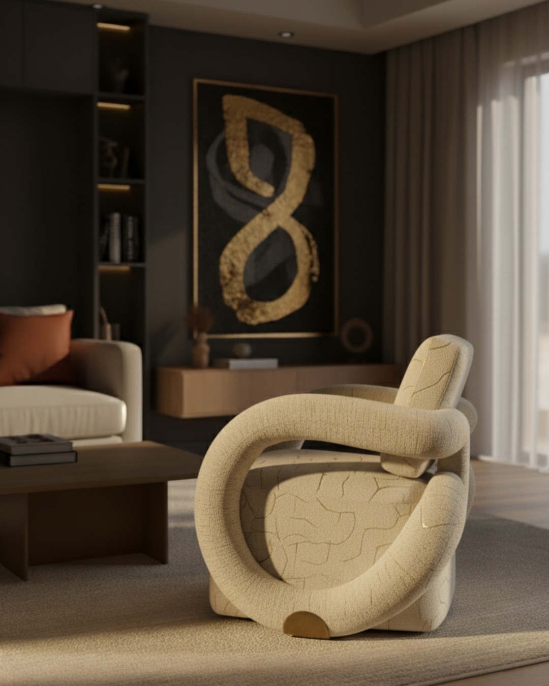
The copy carried the argument the image could not.
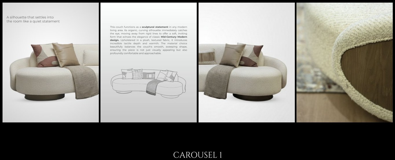
Each piece was written as sculpture with a function attached rather than furniture with a shape.
The organic curve as a focal point rather than a style choice. The deliberate contrast of stone against warm metal. The detail you are meant to miss on first look. Minimal design does not explain itself. Somebody has to.
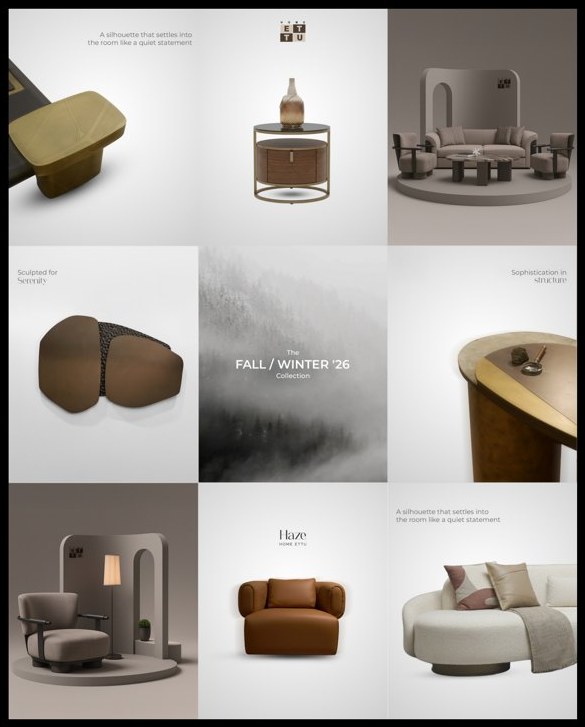
A release framed as a mood, not a drop of new SKUs.
The Fall / Winter release was positioned around a single atmosphere rather than a product list. A collection with a mood can be written about for three months. A list of new products can be announced once.
Restraint is a position, and positions need defending.
Working on a classical house and a contemporary one at the same time.
That was the most useful thing about this period. One needed a world built around it. The other needed somebody to say out loud what it had deliberately left out.
Work produced during my tenure at Markethink. Grids and campaign creative shown are from decks I wrote and directed. Product photography belongs to Home ET TU.